1. SIMPLY

Chill Drinks, Hot Buzz.
Simply needed a launch for their new line that would make a big splash on socials, so we dropped the juicy gossip in a big way—literally. Influencers were surprised with a giant PR box including a flight of Simply’s new line of prebiotic sodas paired with a mini fridge to keep things chill, and all of the essentials for a night in worth savoring.Box Design


Merch Design


Social Buzz
2. UBER
A Service Expansion That Makes You Say GAAA.
Everyone knows Uber Eats delivers takeout. But nowadays you can get almost anything— groceries, alcohol, and more. You can't get a yacht. Or narration from Helen Mirren. We're in the biz of delivery, not miracles.TVC
Social Ads
Conversion Ads
3. GORILLA Rx
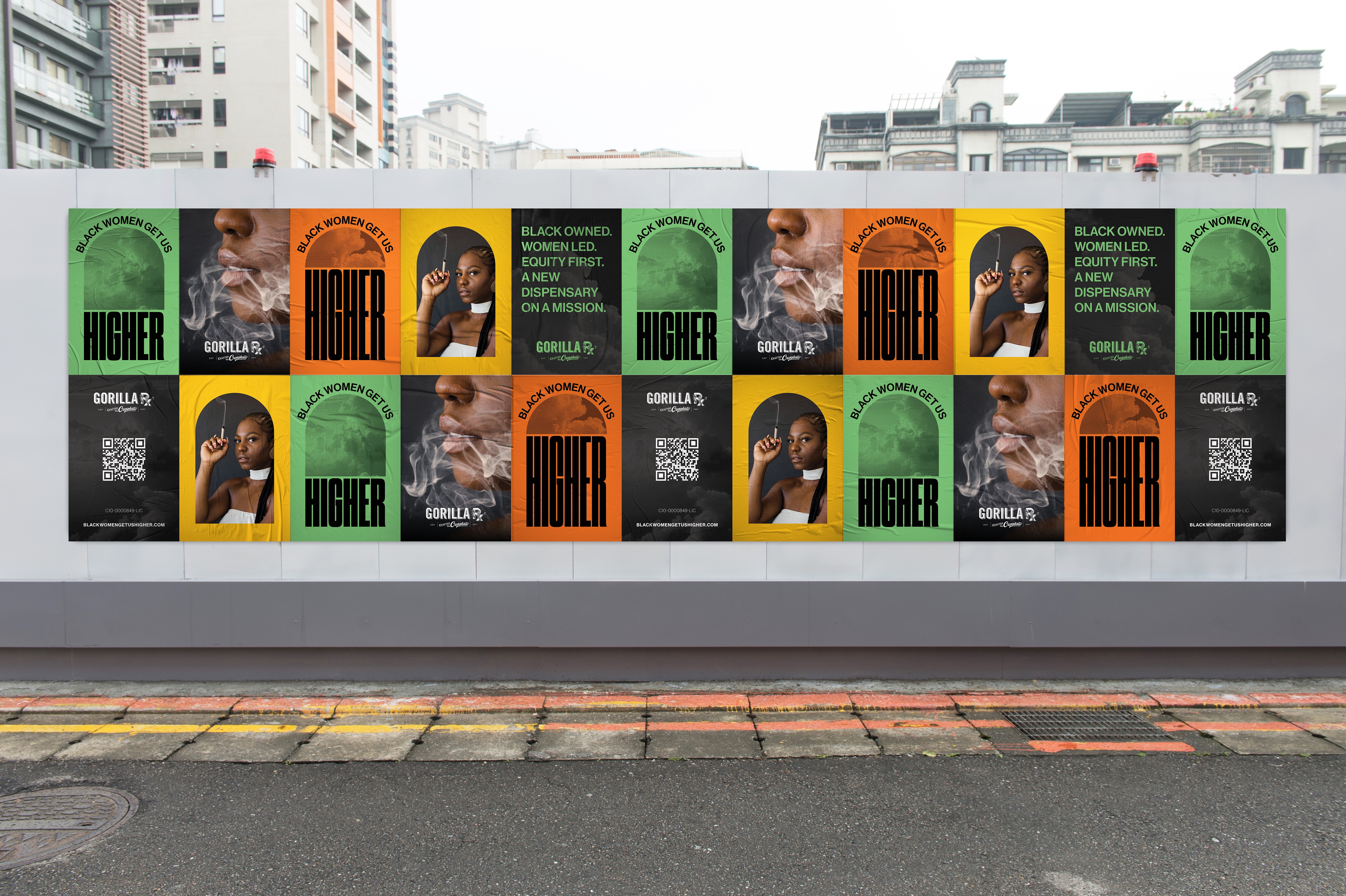
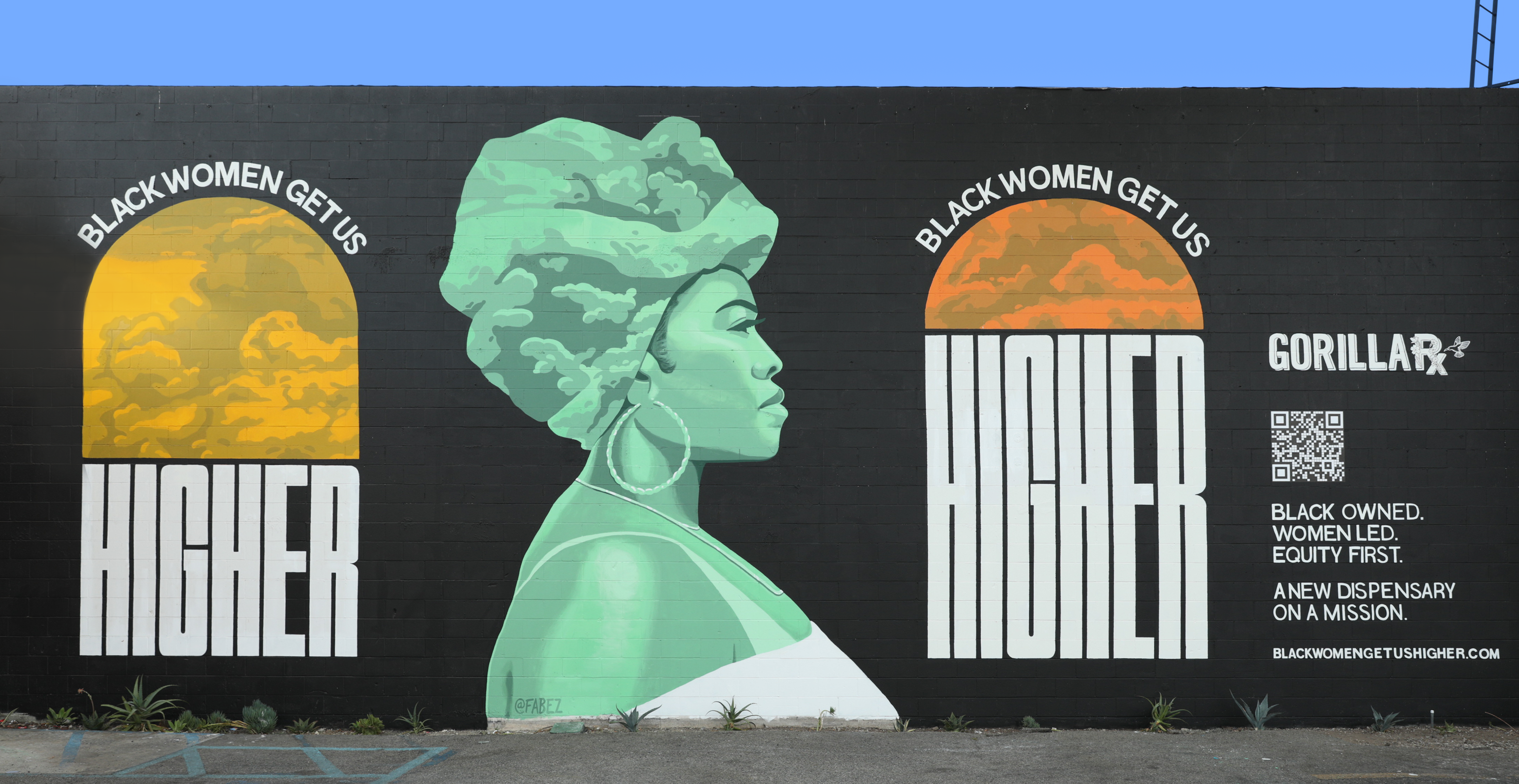
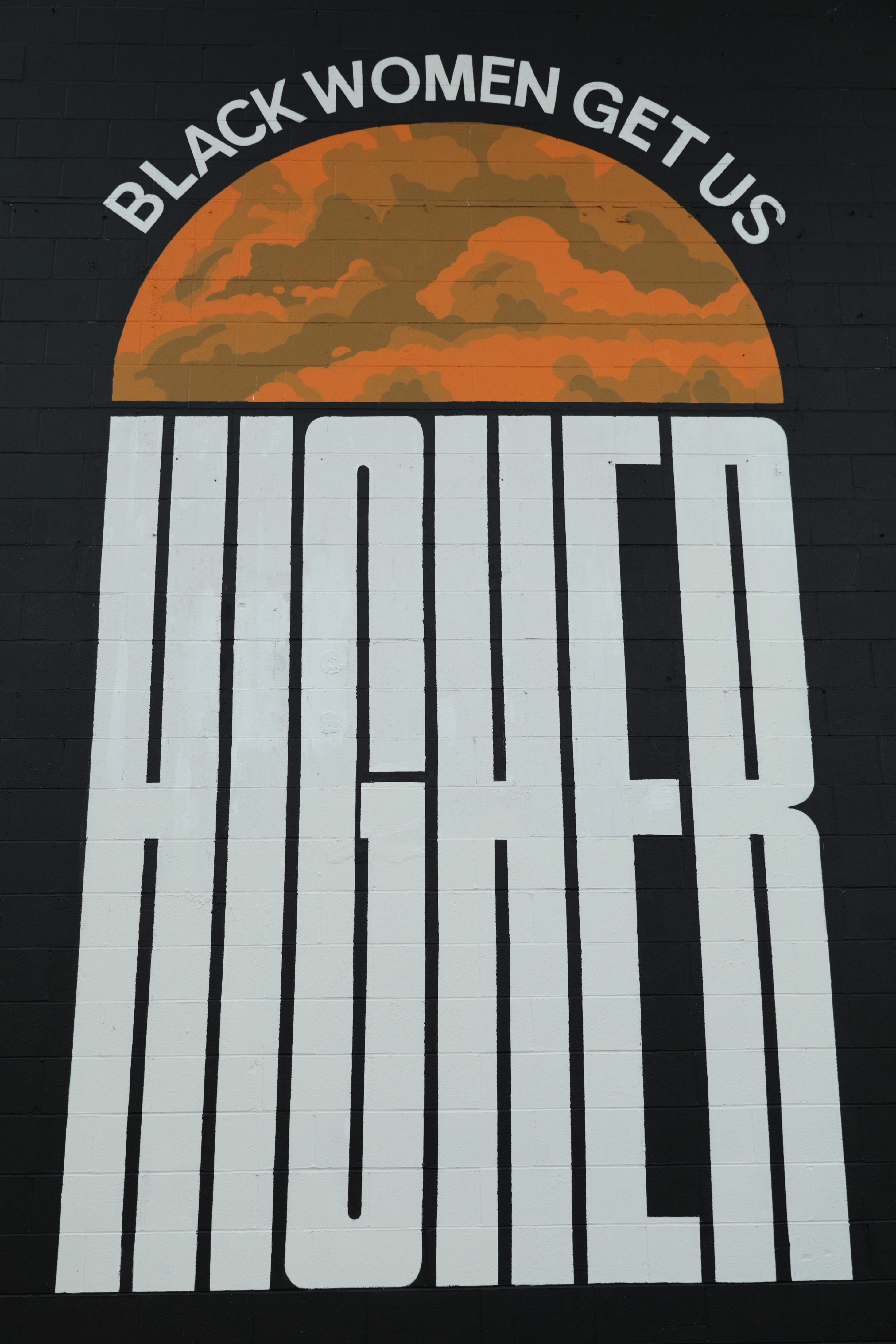
Black Women Get Us Higher.
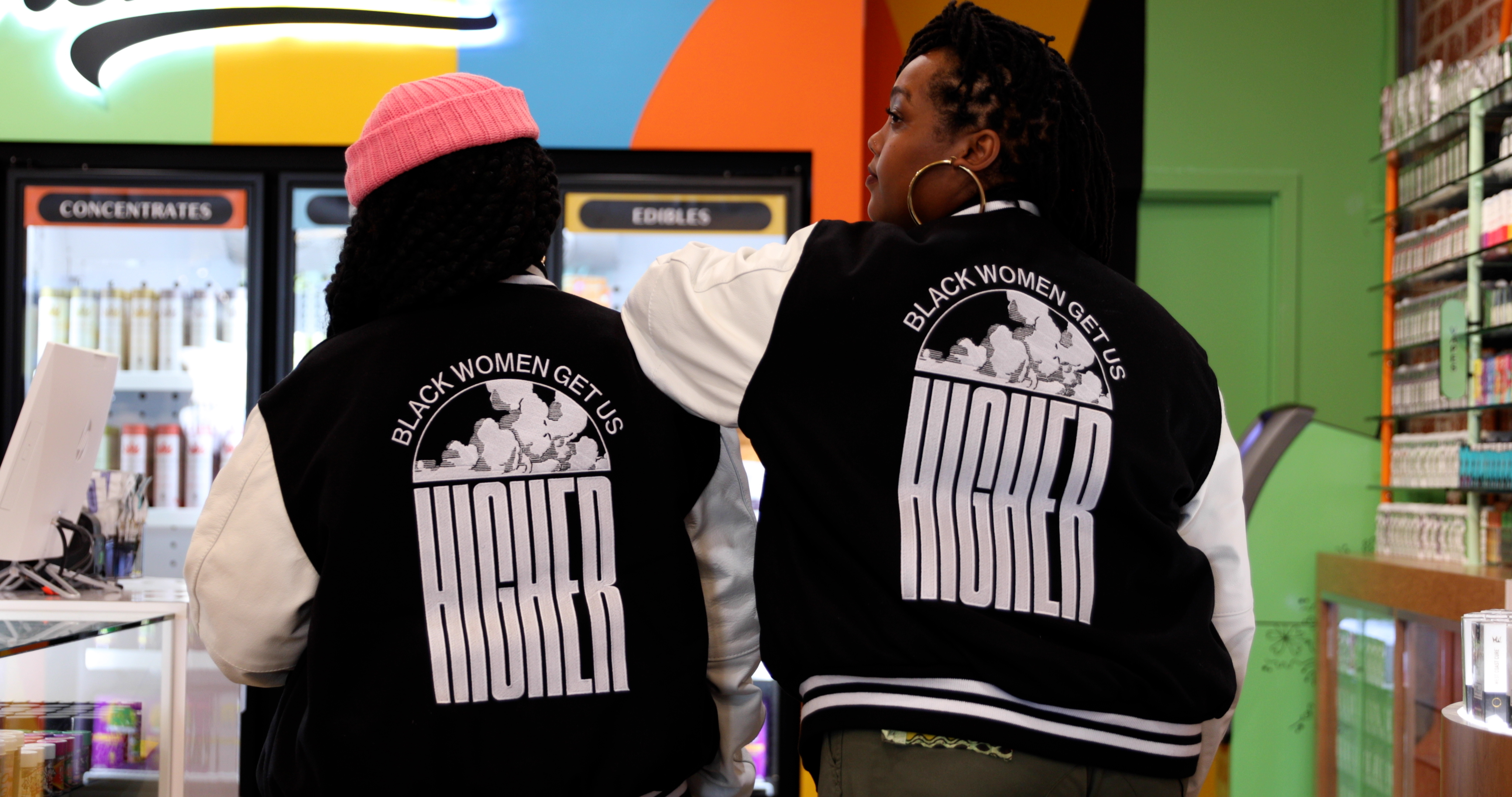
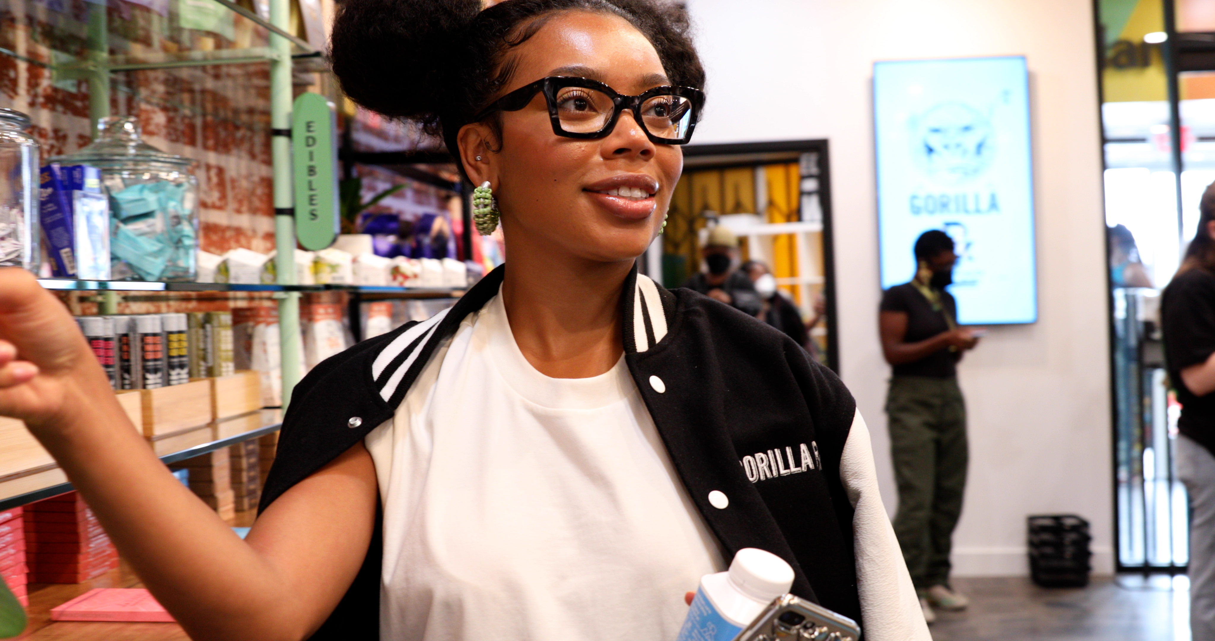
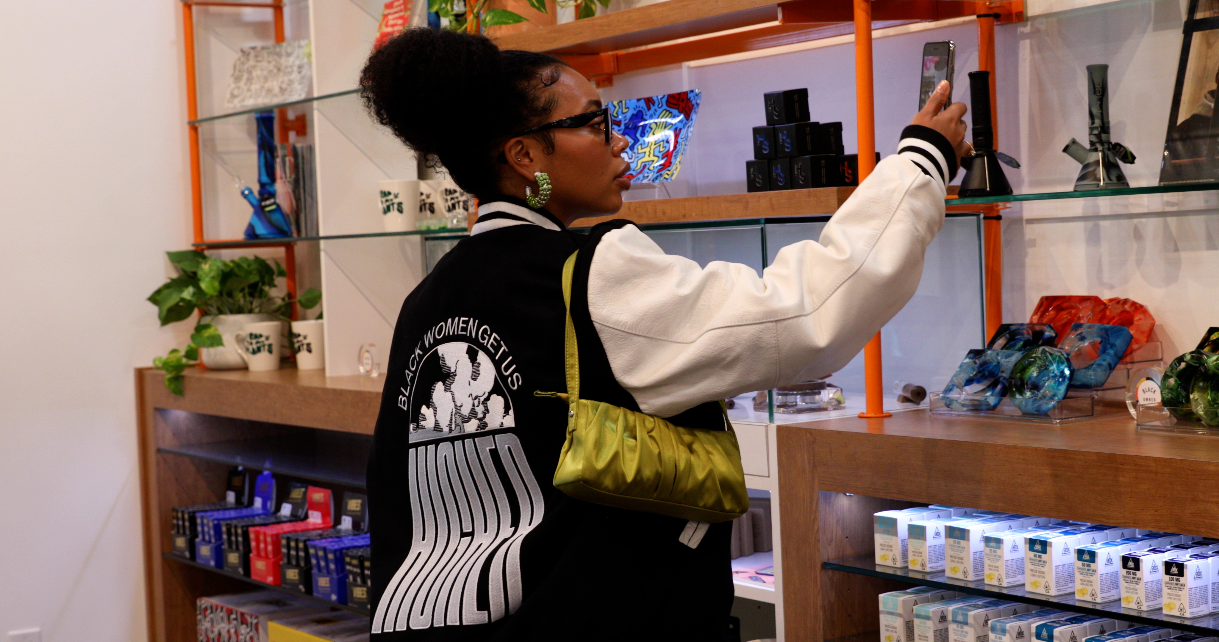
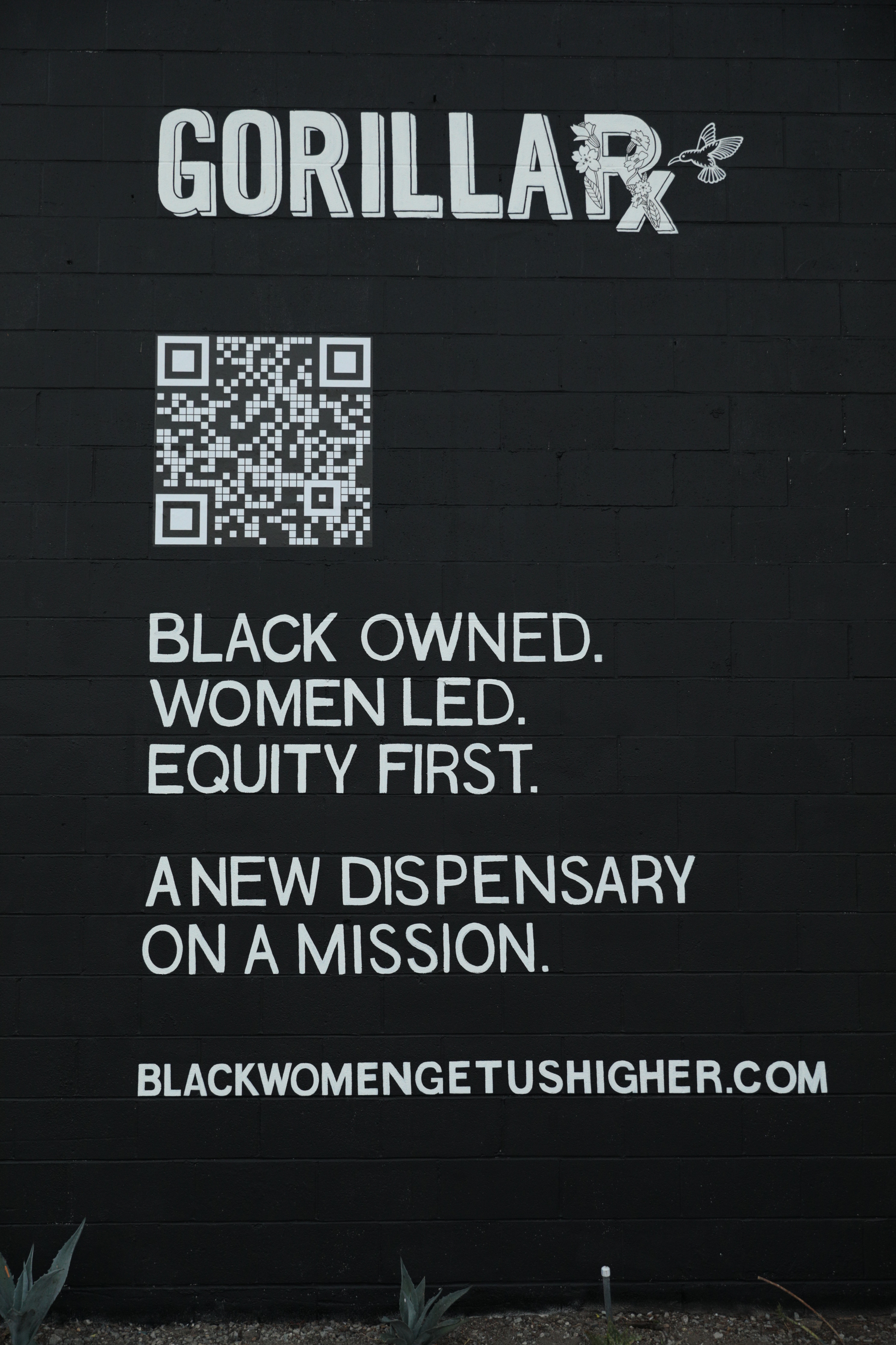
We helped launch Gorilla Rx, Los Angeles’s first Black woman-owned cannabis dispensary—but it was never just about a storefront. Grounded in the brand’s values of equity and community activism, we sparked a movement that reminded people that their purchases are tied to collective progress. Despite this hyper-localized tactic, our campaign grabbed the nation's attention.Gold Clio "Brand Identity" 2023
Wildpostings
Merch

Mural
In collaboration with Alfanso Garcia

Website
Press
4. 826NYC
The times have changed, and so have we.
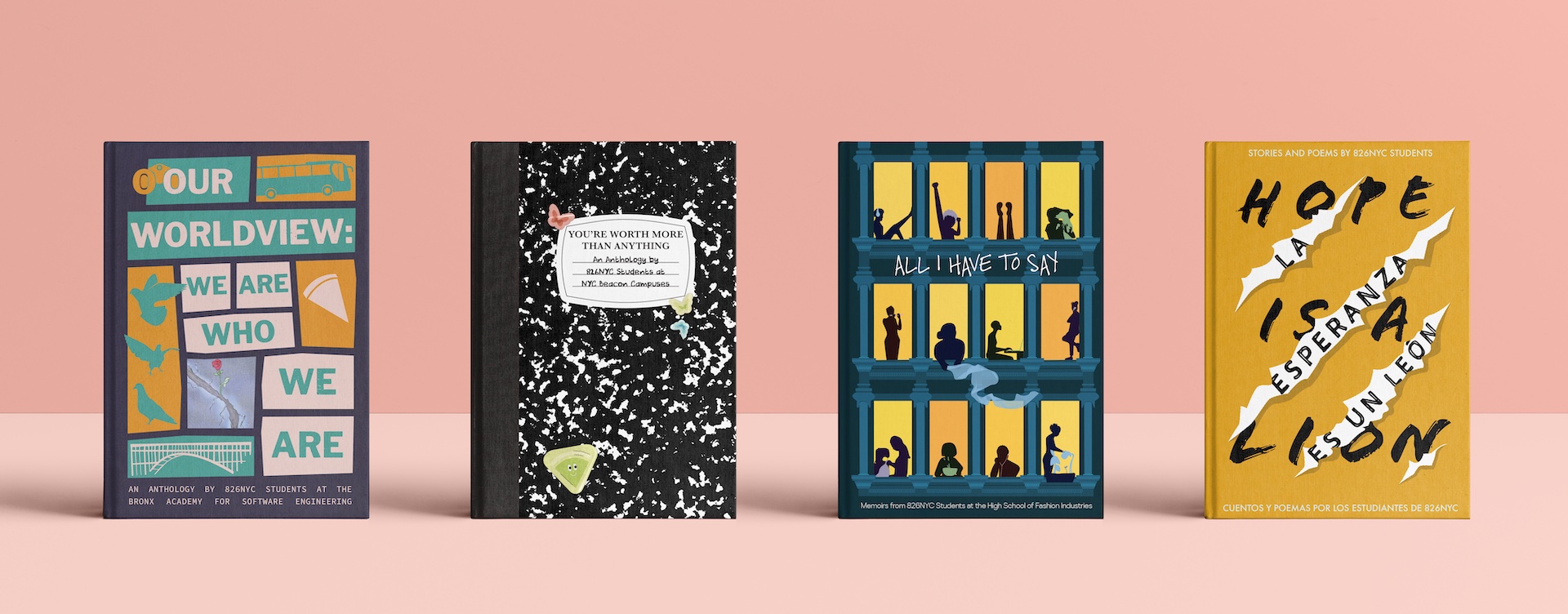
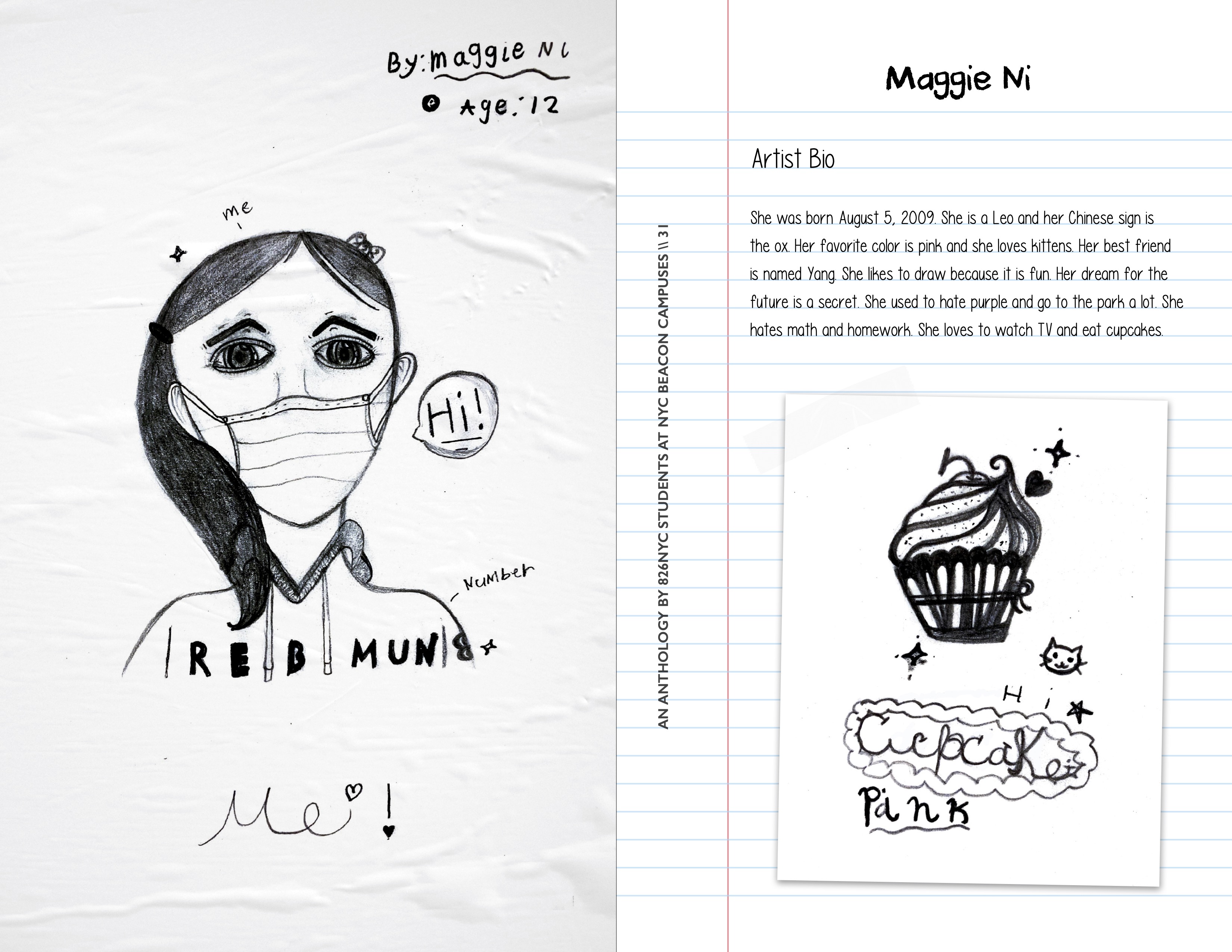
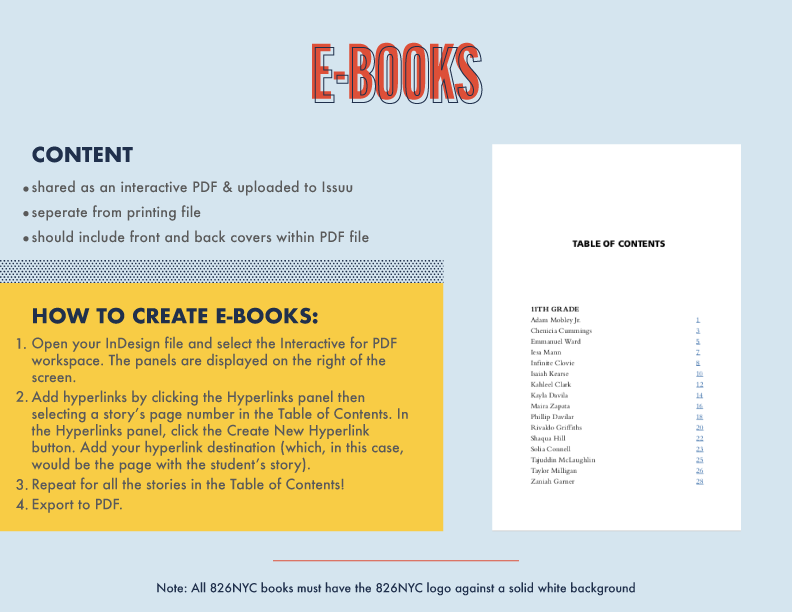
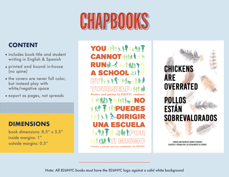
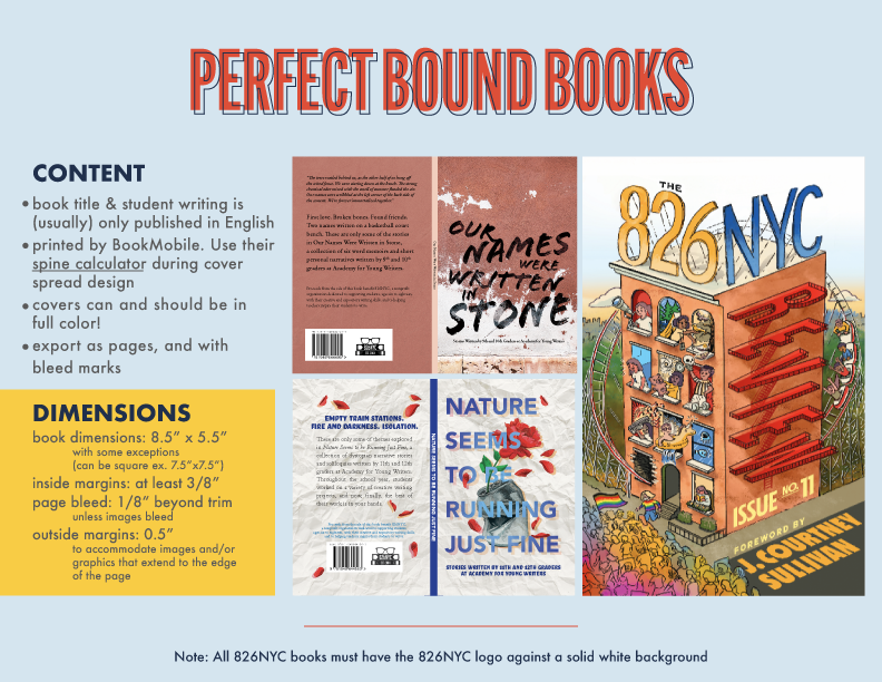
Collaborating with 826NYC, I crafted flexible design solutions to bring student voices to life across multiple publications. To support ongoing creativity and consistency, I developed templates and a style guide that empower volunteers while keeping the brand strong.Our Worldview: We Are Who We Are
This cover unites New York–inspired motifs from student writing in a print-block design, anchored by a featured student artwork at its center.

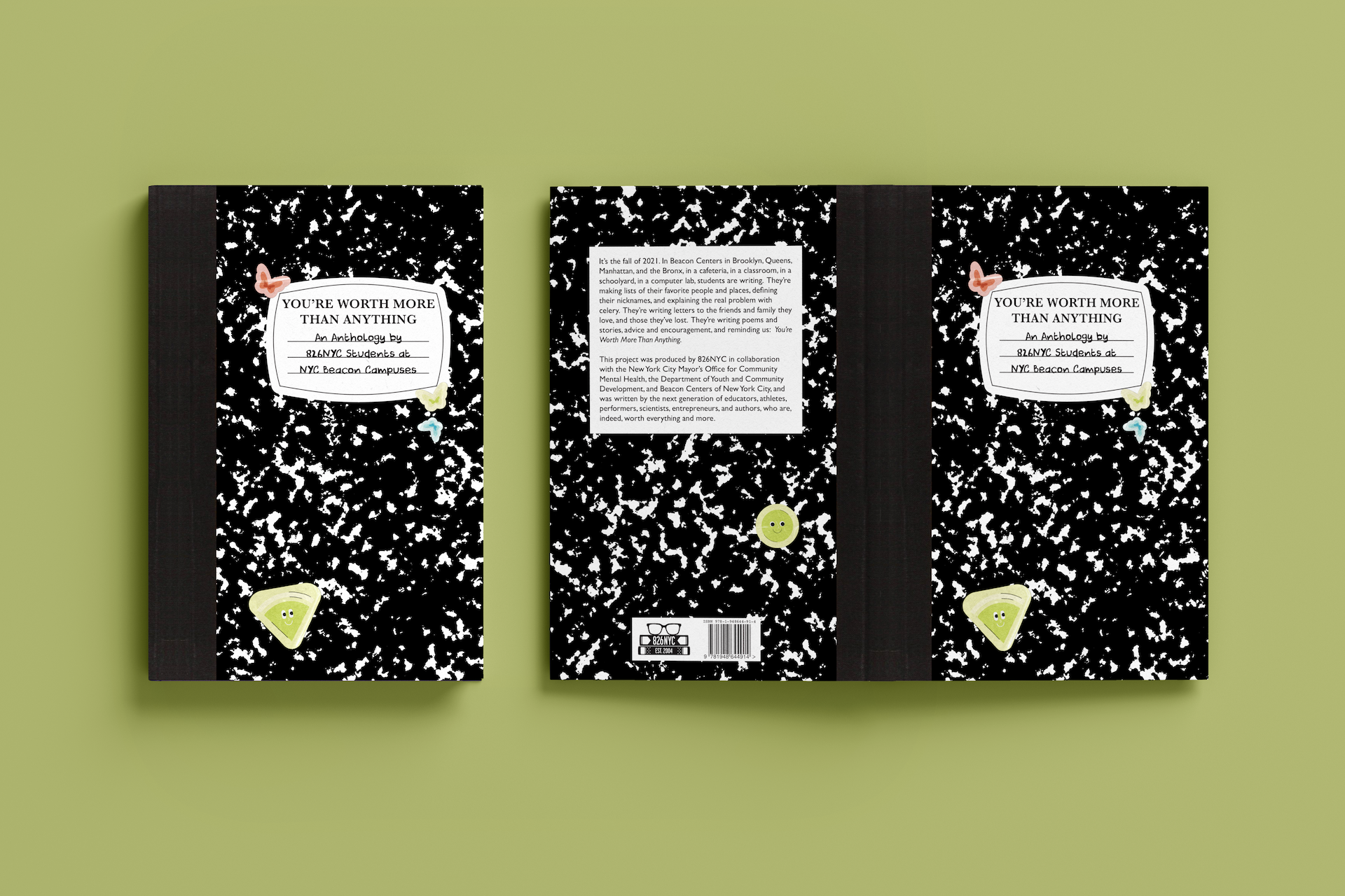
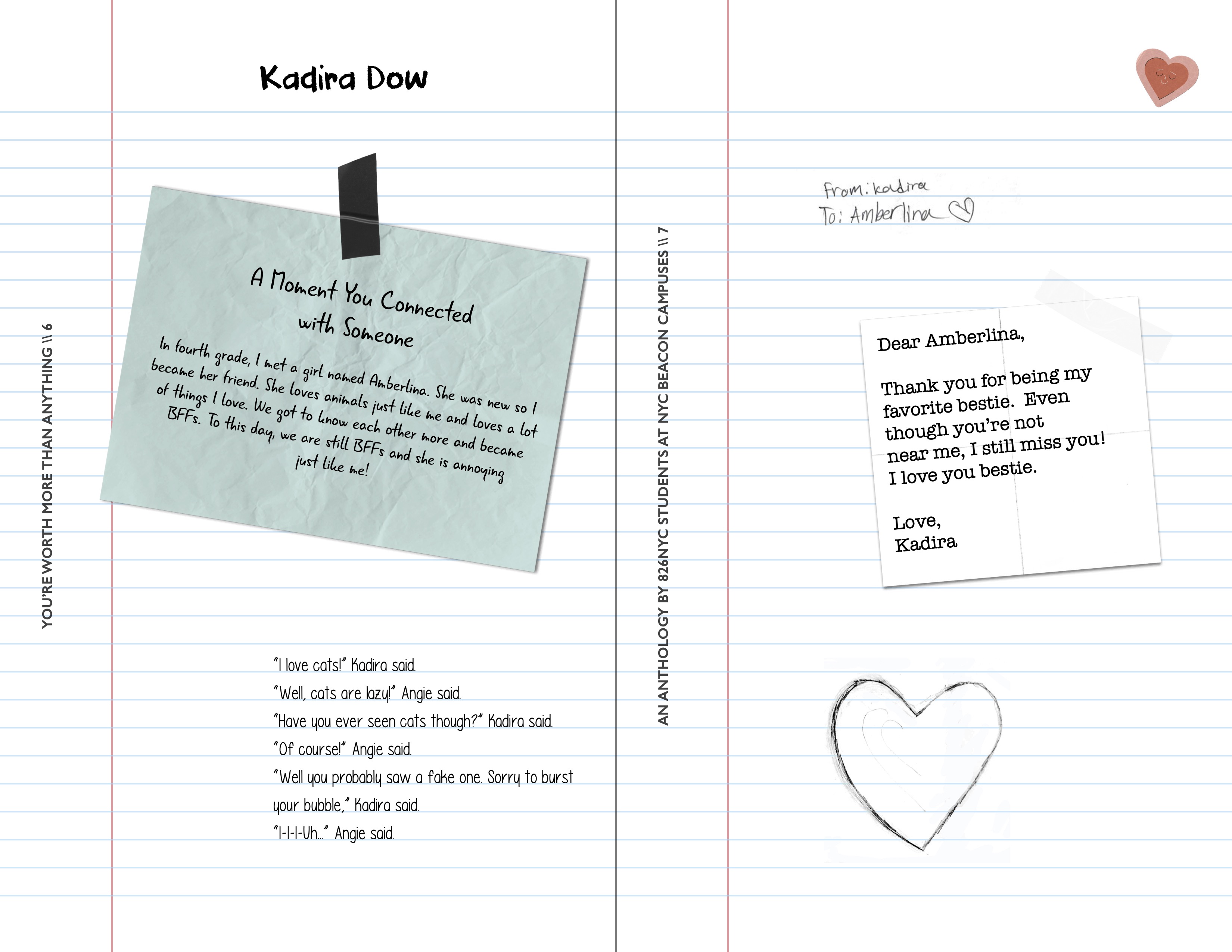
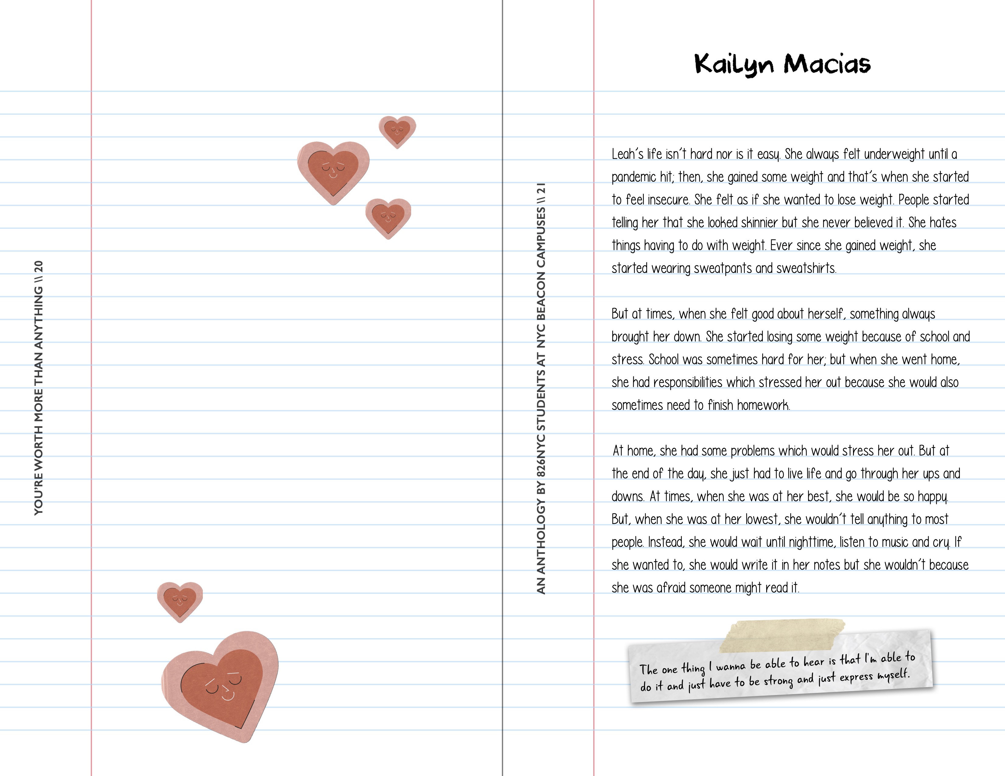
You’re Worth More Than Anything
Students’ journal entries come to life in a classic composition book, refreshed with stylized custom stickers for a modern twist.
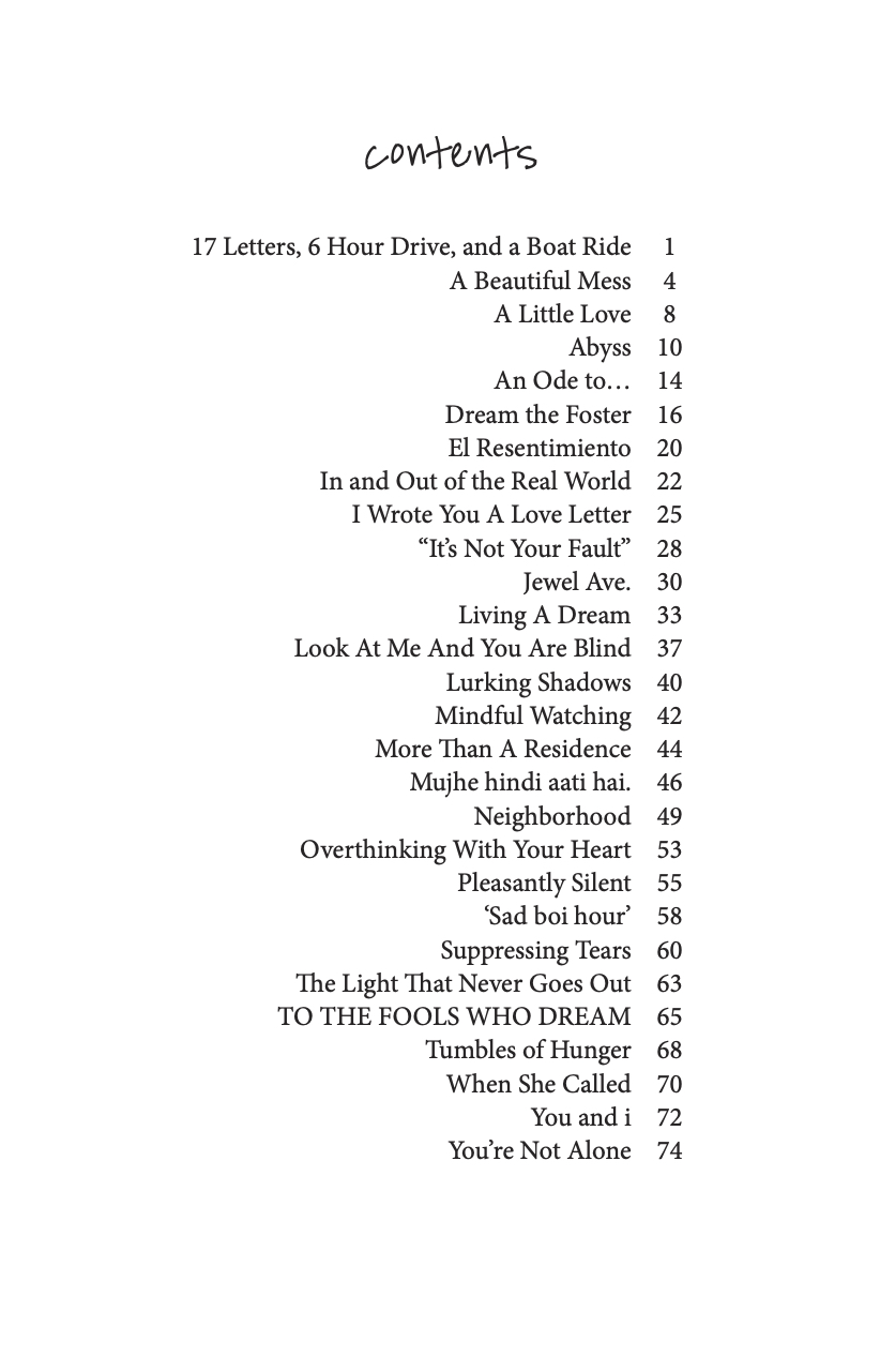
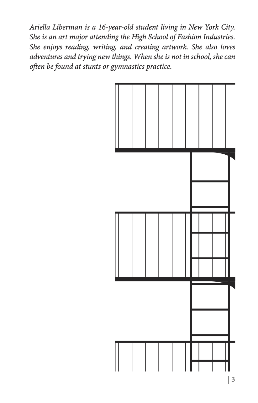
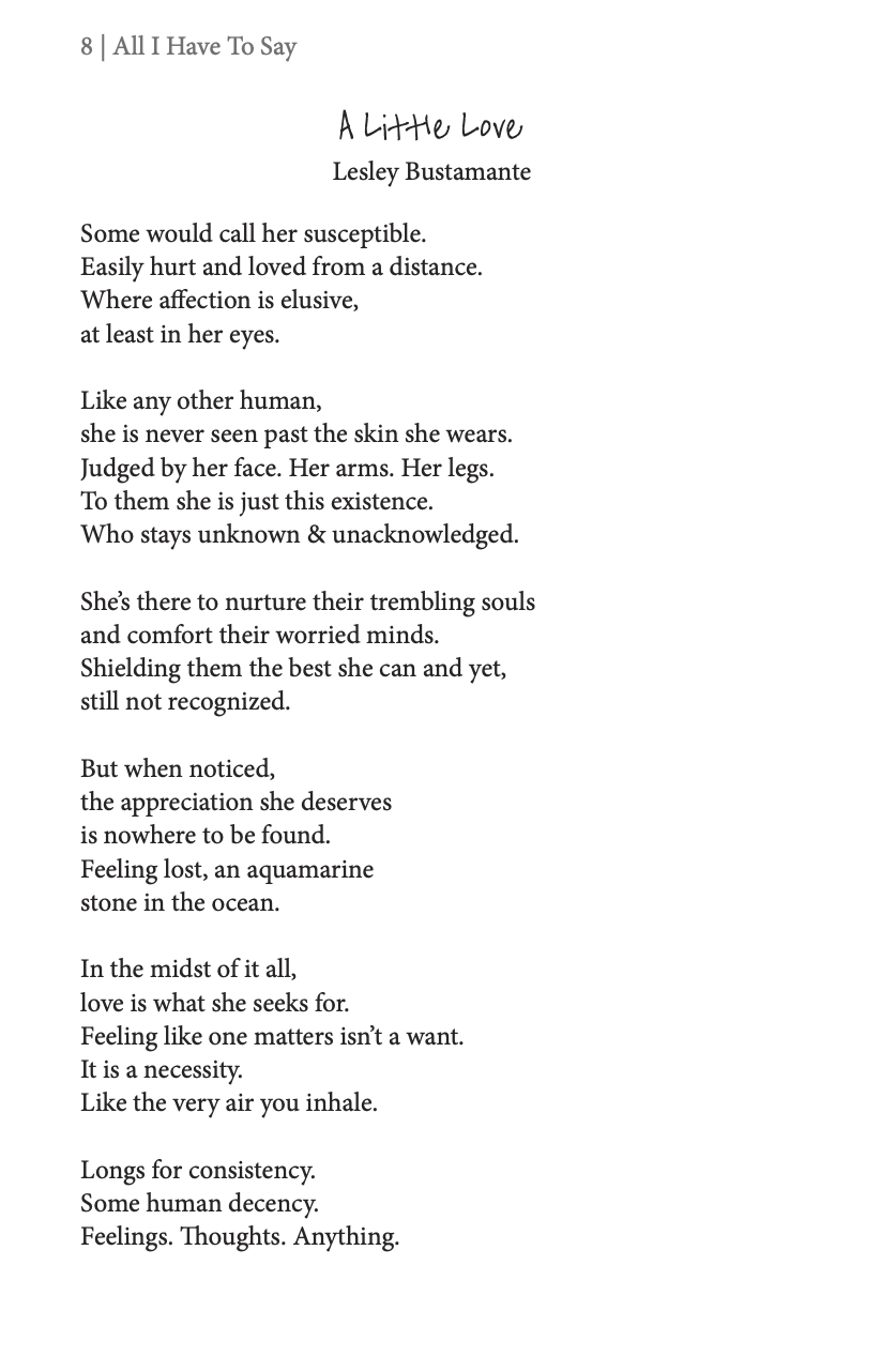
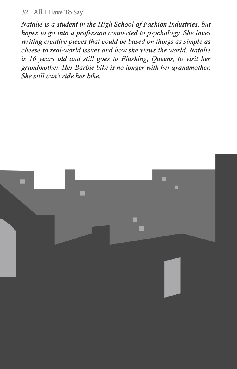
All I Have to Say
Celebrating these young authors’ love for their city, this cover and book design capture the quintessential New York experience of seeing and being seen through apartment windows.


Hope Is A Lion
The cover’s ripped-through effect cleverly ties into the title, uniting its bilingual text in one seamless, thoughtful design.

Book Design Guide
5. NETFLIX

Upside Down Netflix
TikTok killed the trailer. Chronically online audiences need more than a teaser or two to get excited about upcoming shows, so to promote season 4 of Stranger Things, we’re turning familiar UX systems topsy-turvy.2022 Cannes “Young.Monks” Shortlist
UX Takeover
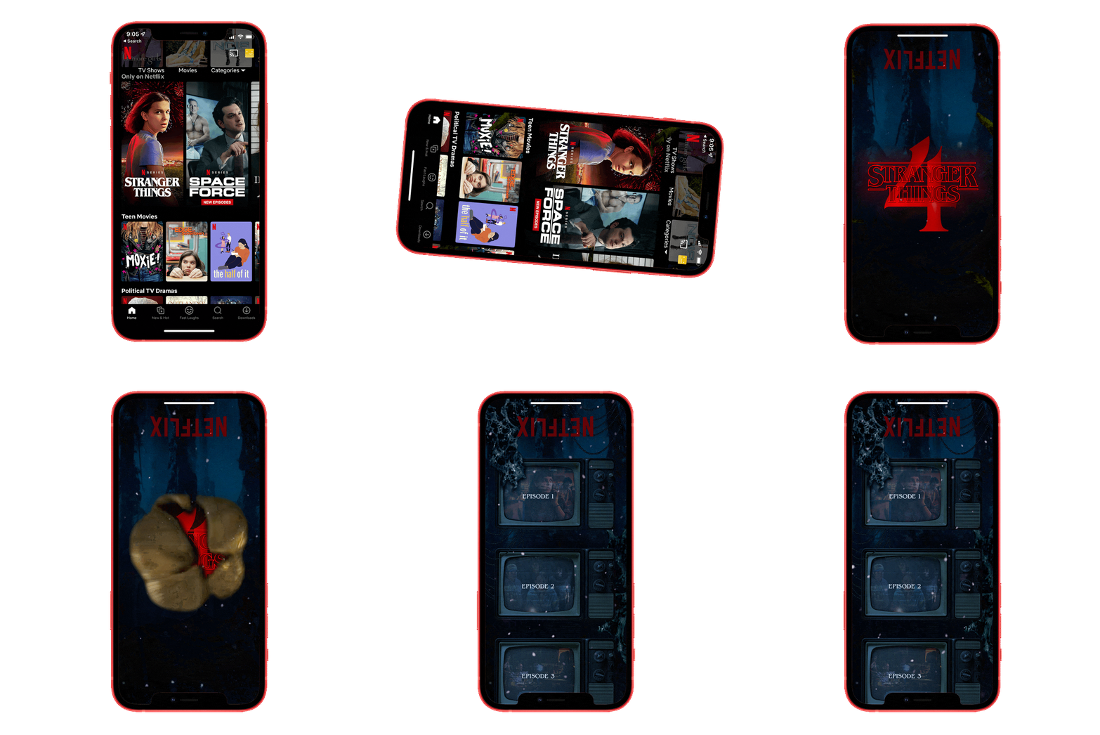
To cater to emerging audiences that are glued to their smartphones, we used the Netflix app to open the portal to the Upside Down for one week only. This immersive UX experience is triggered by turning your device upside down, and allows visitors to stream Stranger Things season four before anyone else.
Unique Ads for Light and Dark UX
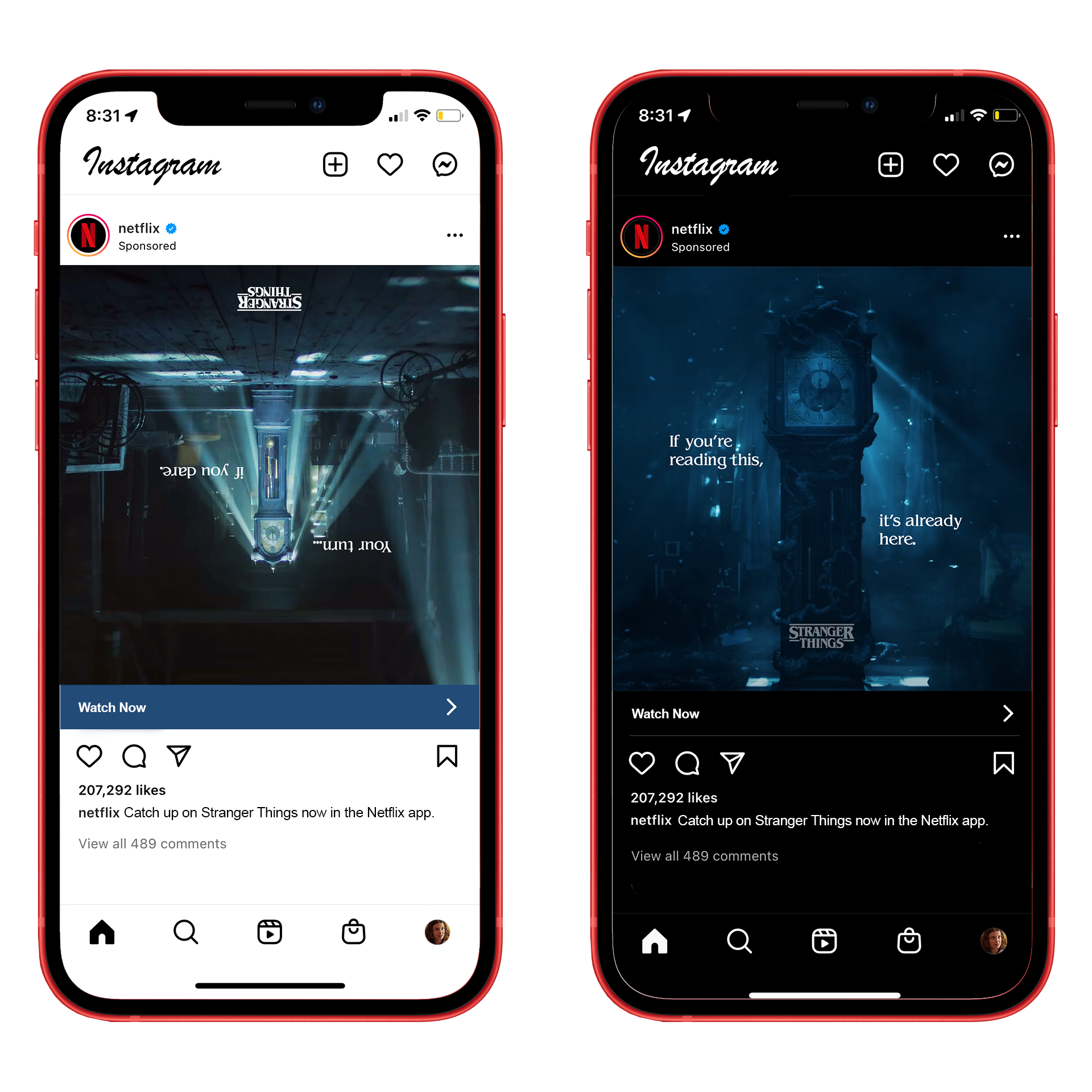
We put curiosity racer’s sleuthing skills to the test on Instagram, Twitter, Facebook, and Snapchat by creating unique ads that appear in “alternate feeds” when users are set to “dark” or “light” mode. Light mode users see an upside down advertisement that nods to the movement needed to trigger Upside Down Netflix, and dark mode users see a message from the Upside Down suggesting our early release.
See Yourself in the Upside Down
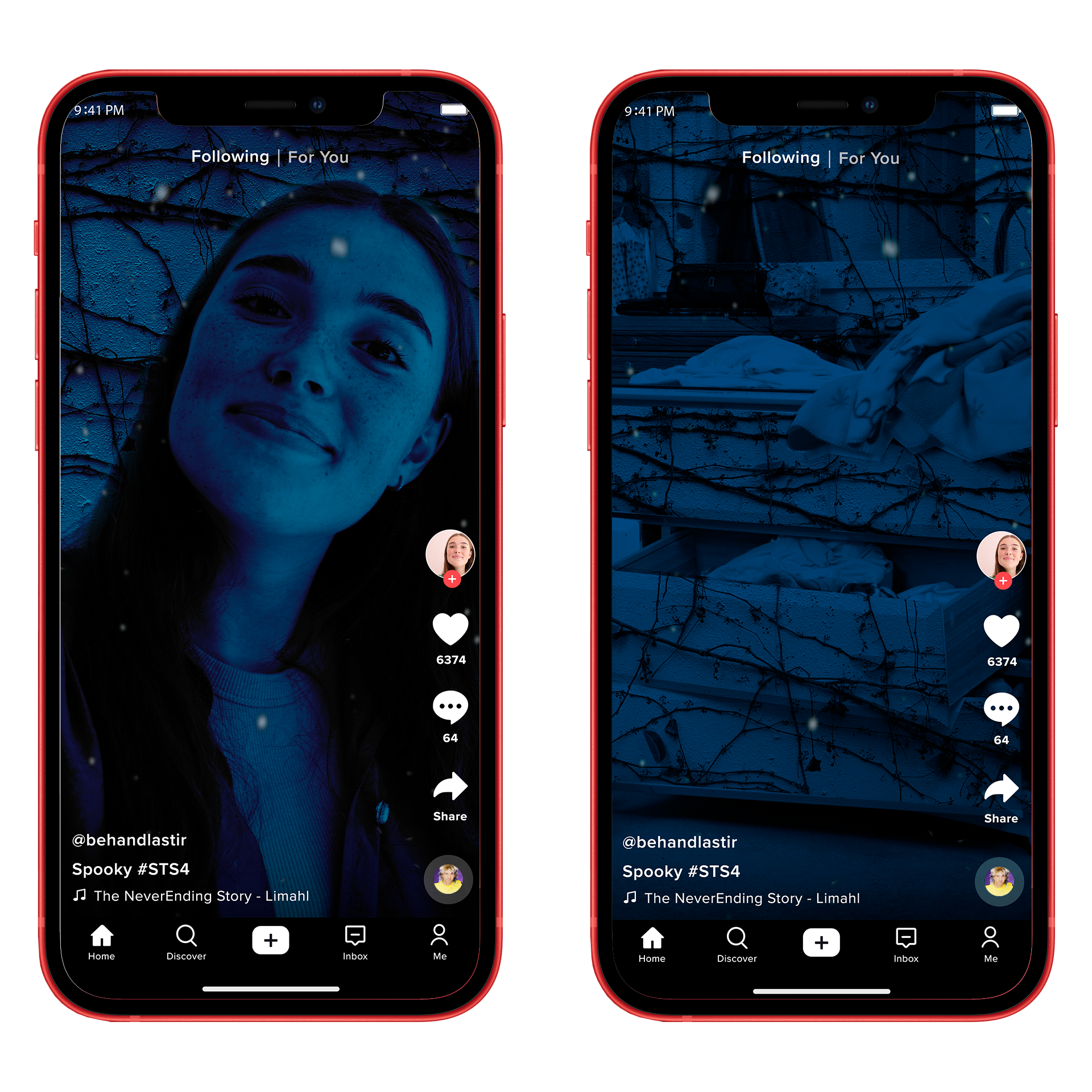
For casual viewers who aren’t as sleuthy as our core fanbase, we created an interactive Tiktok and Snapchat AR filter that transports you and the world around you into the Upside Down.
Earned Media through FOMO
We let our curiosity racers do what they do best— gloat about their exclusive, never-before-seen findings on social media. Because Upside Down Netflix is only live for one week prior to the actual season four release date, having a select few see the season in its entirety only drums up more excitement for those who missed out on our activation.


